Docs
Components
Components
Explore the wide range of beautiful and reusable components available in BuouNext. Learn how to integrate these components into your project to enhance your application's UI/UX, including buttons, forms, modals, and more, all designed to provide a seamless user experience.
🚀 BuouNext Component Documentation
BuouNext includes most of BuouUI’s dynamic UI components, along with all the core components from shadcn.
🌟 What's Included?
🧩 Dynamic Components from BuouUI
BuouNext incorporates all dynamic UI components from BuouUI, offering advanced and highly interactive components tailored for modern web applications.
Key Features:
- ✅ Fully customizable
- ✅ Highly interactive
- ✅ Optimized for performance
- ✅ Dark moder
- ✅ Modern/Clean/Fashion animations
Examples:
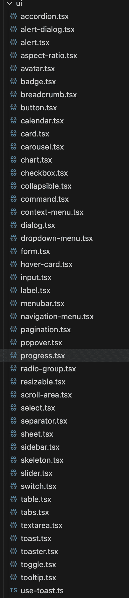
🛠️ Base Components from Shadcn
In addition to BuouUI, BuouNext includes all the base components from Shadcn, enabling a strong foundation for building beautiful and functional interfaces.
Key Components:
...
These components are lightweight, accessible, and easily extendable.
📚 Getting Started
To start using these components in your project:
import { Button } from "@/components/ui/button"
import { Modal } from "@/components/ui/modal"

export default function Example() {
  return (
    <div>
      <Button variant="primary">Click Me</Button>
      <Modal title="Hello World">
        <p>This is a dynamic modal from BuouUI.</p>
      </Modal>
    </div>
  )
}
Extra Info
you can find them in component/ui floder